Olympia Tool & Die
An HO kit #4156 Offering from ITLA Scale Models Inc.
My friend David Gardner required a corner structure for his harbour front town where the building did not have to be a "true" rectangular shape.
The modular wall offerings from ITLA Scale Models fit the bill nicely.
Here is my finished version of the model.
My step-by-step techniques will be found further on in this blog entry.
You can enlarge the images by clicking on them and return to the default look of the page by clicking outside them.
The company's initials of ITLA stand for "Imagine That Laser Art".
While the kit does come with many excellent details for the walls and roof, you can order additional wall and roof detailing in separate packages...which we did.
Because we had a predetermined spot for the structure, it's footprint was already dictated to us. It would not exist as a standard rectangular shape.
With each of the four walls being of different lengths, the modular sections were broken down even further.
Note that I have not placed the cement stairs leading to the ground from the doorways as of yet. I will do so when I determine the width of the sidewalks we will be using for our harbourfront scene.
I really appreciate the "built in" patches of concrete areas which show on some of the wall sections.
For an old company, it is certainly one classy looking building from this modeler's point of view!
Love that ductwork leading from the lower wall to the upper roof!
The loading area. Here is where trucks will be able to back right up to the large loading zone.
The concrete pilasters act as "joint covers" when putting the model together.
Nicely weathered.
Some metallic paint drybrushed atop the ductwork helps bring the scene to life!
Let's start from the beginning. Here is the booklet that comes with the kit.
I appreciate the clear instructions with colourful pictures to support the various steps in building. You are also advised to visit their website for further modeling tips which is great!
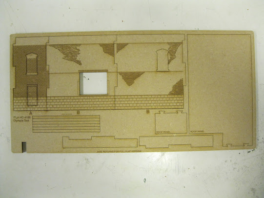
The laser cut walls are thick and sturdy and very easy to remove from their templates.
The brickwork and foundation work is immaculate.
Various other components come with the kit.
These next few images were taken at David's layout. Note how each wall section fits nicely into the next. The concrete pilasters will hide the joints.
We are simply "test fitting" the structure as to how it will sit on the street corner.
My friend Carl cut out the exact shape of the base on styrofoam for me to take home where I will build the model.
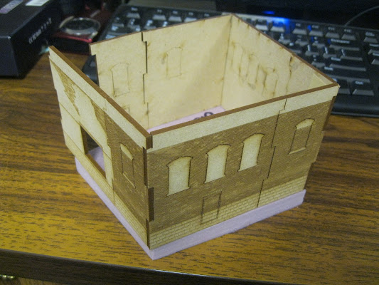
With the base I am now able to begin the rudimentary construction of the structure.
I've punched out the window and door openings and have placed all the wall sections together in a linear fashion for the sake of this photo.
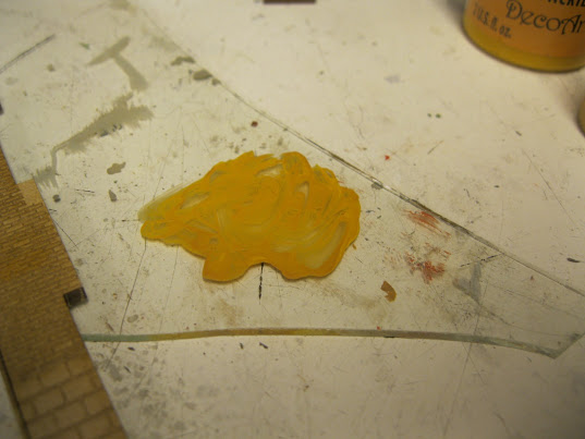
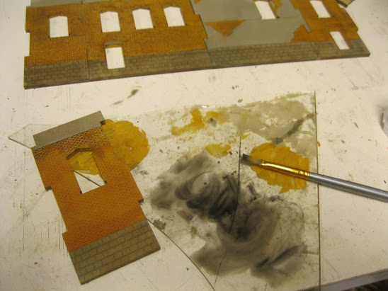
We decided on a yellow brick colour so I combined Marigold with Honey Brown.
Almost a mustard colour mixture.
Mudstone offers up a nice concrete tone.
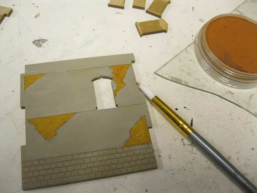
A touch of Pan Pastels in the "rust range" help bring out the brick further.
You can note the difference with the Pan Pastel coloured wall which is located second from the right with the concrete exposed.
I am happy with the result of that wall so all others get the similar treatment.
I simply dry brushed the Pan Pastels atop the brick face.
All walls are now done with the brick and concrete colouring.
I then took a brown Pan Pastel and worked the foundation area.
As viewed under incandescent lighting.
A wash of black acrylic paint at the top of the narrow wall section showcases the look I want to achieve.
The window areas are now painted a chocolate brown and will soon be inserted into the window openings.
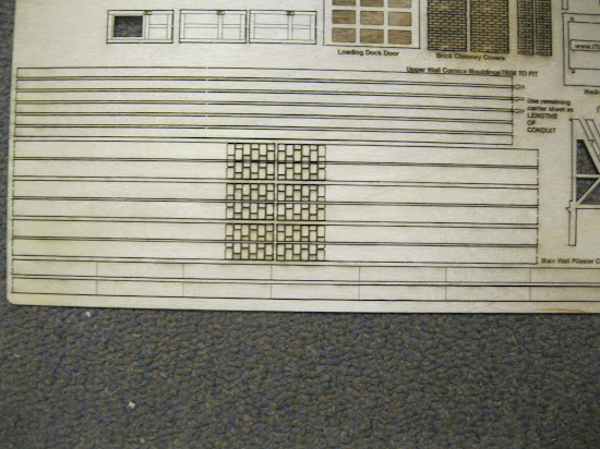
Here is another sheet of materials, this time thinner.
It holds the doors.
The chimney section.
The billboard sign.
And...the pilasters.
A view of the other thicker sheet of laser cut wooden sections.
The headers for the window and a roof vent with an optional doghouse.
Two sections are ready to go together. I will match up the foundation colours in short order.
One of the pilasters goes in. Because it is made of a different wood than the walls, the colouring is slightly different...but we'll weather things up.
The window headers are beginning to go in place.
Two are in along with the window sills.
All headers and sills are now in place.
A closer look.
Coming together!
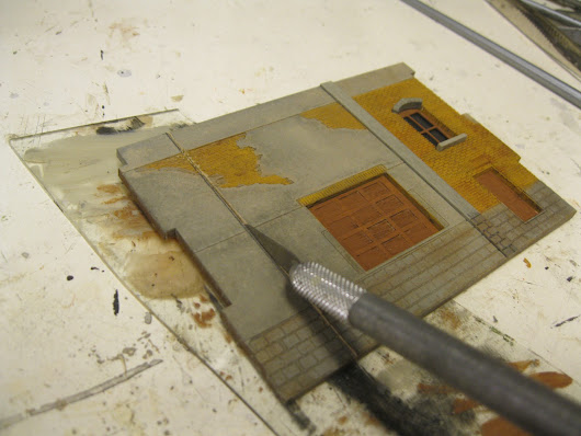
I've drawn a line where I will have to make my very own "custom" cut.
Remember, the building is a quadrilateral with all four walls being a different length.
The metal square comes in handy here to ensure perfect right angles.
I first scored the line with an X-acto blade.
Then my small saw went to work.
The cut-off section will be added to the back wall to improve its length.
Lining up the joint.
That's better!
Again the pilaster columns serve to conceal the joint.
Just about 100% correct atop the base!
Elastic bands and my heavy weights ensure the quadrilateral shaped structure stays in place as the glue sets.
To create the roof to exact dimensions I will scribe the shape at the base of the building on strong cardboard.
There's the shape.
Just right!
It's a perfect fit!
Time to add character to the roof. Wet glue begins the process.
Then I sprinkle on tan ground foam.
When it has set, I dab black acrylic paint atop the roof.
The supporting lips for the roof can be seen. I have painted the inside of the upper roof sections grey.
My weights do the trick when glueing the roof in place.
Time to work on the chimney.
Here is the roof ductwork from the external additional roofing kit. The second support from the right still has to be placed properly.
I've painted the ductwork grey and rusted it out with Pan Pastels.
A look from the other end.
Then I drybrushed some metallic paint to finish the ductwork off nicely.
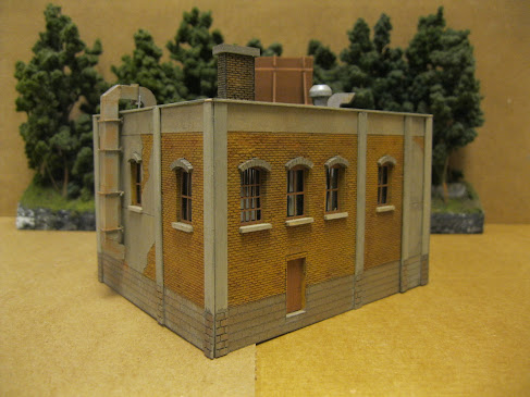
The finished structure as seen from an elevated viewpoint.
The same corner as seen from lower down.
A view of the front of the structure. The signage came with the kit and there were a variety of sign options to put on the billboard. The wall vent came from additional purchase of wall detailing items.
A side view.
A view along the back of the building.
The back again from another angle. Note the wall detail in the lower left section near the loading zone.
I really like the wall sections which are part brick and part concrete showcasing an aging building!
Thanks for checking in on this cool looking build from ITLA Models Inc. This is a Canadian company!
I will add further images of the structure when I get over to David's place and situate the building where it is planned to remain.
All the best, Mike Hamer, Ottawa, Ontario, Canada

















No comments:
Post a Comment